Theming
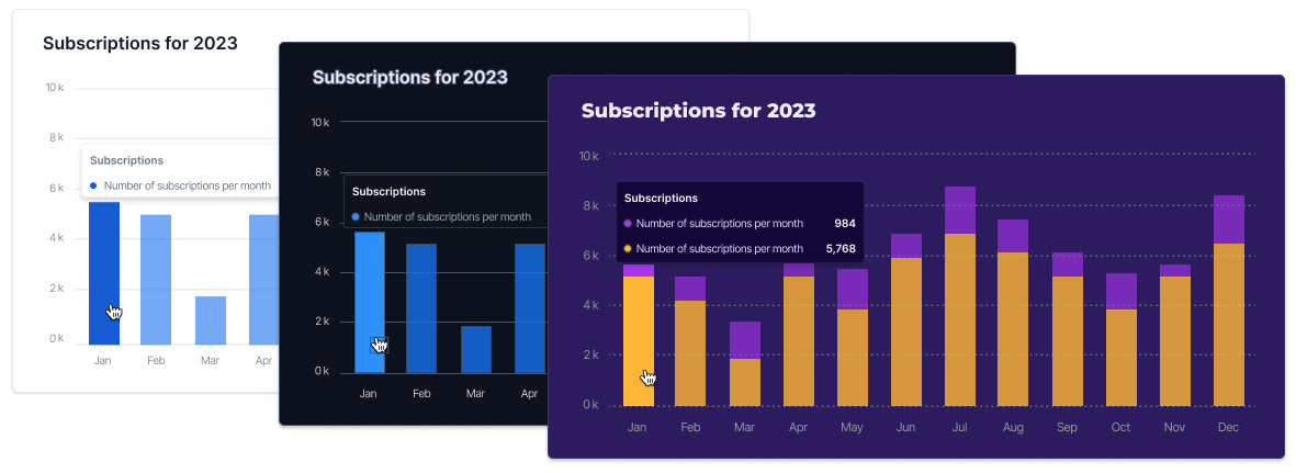
The UI Kit's theme determines essential visual elements, including the colors of components, the depth of shadows, and the overall light or dark appearance of the interface. We provide both light and dark themes as well as the ability to customize your own theme. The UI Kit uses the light theme as the default.
ThemeProvider
To customize the theme, it's necessary to employ the ThemeProvider component, which injects a theme into your application. This step, however, is not mandatory as UI Kit components are pre-equipped with a default theme.
The ThemeProvider utilizes React's context mechanism to propagate the theme to the components. Therefore, ensure that ThemeProvider is positioned as a parent to the components you wish to customize. Further details are available in the ThemeProvider API reference.
Theme configuration
Adjusting the theme configuration variables is the most effective approach to customize the UI Kit according to your unique needs.
Tokens
Each token in the theme object is represented as both a CSS Custom Property and a corresponding JavaScript property, e.g. --propel-font-family and fontFamily. The CSS Custom Properties are prefixed with --propel- which helps to prevent any potential naming collisions with other stylesheets. Further details are available in the ThemeProvider API reference.
Default values
The content in themes.module.scss serves as the foundational entry point for theming within the UI Kit.
/** themes.module.scss */

@use './typography';
@use './lightTheme';
@use './darkTheme';
The common.scss file contains the common theme configuration, defining a series of CSS custom properties that are
shared by both the light and dark themes.
.commonTokens {
  /* Typography - Regular */
  --propel-font-family: 'Inter';
  --propel-font-size: 16px;
  --propel-font-weight: 400;
  --propel-line-height: 150%;

  /* Typography - Tiny */
  --propel-tiny-font-family: 'Inter';
  --propel-tiny-font-size: 0.625rem;
  --propel-tiny-font-weight: 400;
  --propel-tiny-line-height: 150%;

  /* Typography - Small */
  --propel-small-font-family: 'Inter';
  --propel-small-font-size: 0.75rem;
  --propel-small-font-weight: 400;
  --propel-small-line-height: 150%;

  /* Typography - Heading 1 */
  --propel-h1-font-family: 'Inter';
  --propel-h1-font-size: 3.5rem;
  --propel-h1-font-weight: 600;
  --propel-h1-line-height: 120%;

  /* Common colors */
  --propel-component-height: 300px;
  --propel-success-primary: #669f2a;
  --propel-success-secondary: #ceeab0;
  --propel-error-primary: #f04438;
  --propel-error-secondary: #fecdca;

  /* Spacing */
  --propel-space-xxs: 4px;
  --propel-space-xs: 8px;
  --propel-space-sm: 10px;
  --propel-space-md: 16px;
  --propel-space-lg: 24px;
  --propel-space-xl: 32px;
  --propel-space-xxl: 40px;

  /* Border radius */
  --propel-border-radius-xs: 2px;
  --propel-border-radius-sm: 4px;

  /* Shadows */
  --propel-shadow-sm: 0px 2px 4px 0px rgba(17, 19, 34, 0.1);

  /* Color Blue (Brand)*/
  --propel-color-blue950: #102a56;
  --propel-color-blue900: #194185;
  --propel-color-blue800: #1849a9;
  --propel-color-blue700: #175cd3;
  --propel-color-blue600: #1570ef;
  --propel-color-blue500: #2e90fa;
  --propel-color-blue400: #53b1fd;
  --propel-color-blue300: #84caff;
  --propel-color-blue200: #b2ddff;
  --propel-color-blue100: #d1e9ff;
  --propel-color-blue50: #eff8ff;
  --propel-color-blue25: #f5faff;
}
The lightTheme.scss file sets up the light theme for the UI Kit, defining a series of CSS custom properties specific to this theme.
/** lightTheme.scss */

@use './common';

.lightTheme {
  @extend .commonTokens;

  --propel-color-primary: #2e90fa;
  --propel-color-secondary: #cdd5df;
  --propel-bg-primary: #ffffff;
  --propel-bg-secondary: #f8fafc;
  --propel-text-primary: #0d121c;
  --propel-text-secondary: #697586;
  --propel-border-primary: #e3e8ef;
  --propel-accent: rgba(46, 144, 250, 0.6);
  --propel-accent-hover: #2e90fa;
  --propel-color-gradient: linear-gradient(
    180deg,
    rgba(46, 144, 250, 0.35) -11.58%,
    rgba(46, 144, 250, 0.05) 100%
  );
  --propel-color-loader: #e9e9e9;
  --propel-color-loader-animation: #ffffff20;
}
The darkTheme.scss file sets up the dark theme for the UI Kit, defining a series of CSS custom properties specific to this theme.
/** darkTheme.scss */

@use './common';

.darkTheme {
  @extend .commonTokens;

  --propel-color-primary: #2e90fa;
  --propel-color-secondary: rgba(46, 144, 250, 0.35);
  --propel-bg-primary: #202939;
  --propel-bg-secondary: #0d121c;
  --propel-text-primary: #f8fafc;
  --propel-text-secondary: #9aa4b2;
  --propel-border-primary: #364152;
  --propel-accent: rgba(46, 144, 250, 0.6);
  --propel-accent-hover: #2e90fa;
  --propel-color-gradient: linear-gradient(
    180deg,
    rgba(46, 144, 250, 0.35) -11.58%,
    rgba(46, 144, 250, 0.05) 100%
  );
  --propel-color-loader: #2d2d2d;
  --propel-color-loader-animation: #00000020;
}
Customizing the Theme
The ThemeProvider component allows theme customization through its theme prop.
Customization via CSS Class:
// my-themes.css

/* Styles for the ThemeProvider component Stories */

.customTheme {
  --propel-text-primary: #532ab4;
  --propel-border-radius-sm: 20px;
}

// App.tsx

import { ThemeProvider, Counter } from "@propeldata/ui-kit";
import "./my-themes.css";

function App() {
  return (
    <ThemeProvider theme="customTheme">
      <Counter value="10000" card localize />
    </ThemeProvider>
  );
}
Customization via JavaScript properties:
import { ThemeProvider, Counter } from '@propeldata/ui-kit'

function ThemeProviderComponent() {
  return (
    <ThemeProvider theme={{ textPrimary: '#532ab4', borderRadiusSm: '20px' }}>
      <Counter value="10000" card localize />
    </ThemeProvider>
  )
}
This method enables the seamless integration of design tokens from a CSS-in-JS library, like Material UI.